Styling TextInputLayout and TextInputEditText on Android
DISCLAIMER: I don’t know much about Android Themes, Styles and textAttributes. I understand (I think) the difference and how they operate in theory but I find the system extremely confusing, unintuitive, complicated, verbose, poorly supported and completely uneeded. I get the idea behind it, but it’s become a monster and with the addition of the appCompat, material, and other things, it made it even worse, for some things work in some places, under some circumstances. What is sad (about me) is that I started doing Android circa 2009, 2010; I should know better.
Don’t get me wrong, I see what the system is trying to do, but the documentation coming from Google is close to none, you usually have to inspect long lists of undocumented attributes and hope for the best. I know a lot of Android devs; they all end up trying things and seeing if it works. I remember a person spent a month once in a large project trying to sort this out (this was right when Material Design was nice in paper but had zero support in libraries). It was hell for him, and for us. And for what? To be able to set a primary color and then see all text fields change? Really nice, but I swear it was not worth.
In this rant I had to deal with EditTexts for Credit Card entry. Fast forwards to 2017, we have a TextInputLayout and a TextInputEditText, that at least handle the animation of the “hint” for you. This was not the case 2+ years ago. We manually did it by the way. It was horrible but it worked. I hope those guys have replaced the layouts (I’m no longer working there).
Here’s what this is all about:
You have an input field of some sort (EditText, hello?) The XML Layout usually looks like this: (omitted everything irrelevant to make it simpler)
	<android.support.design.widget.TextInputLayout
	                android:layout_width="match_parent"
	                android:layout_height="wrap_content"
	                android:textColorHint="@color/color1"
	                app:hintTextAppearance="@style/MyAppearance">

	                <android.support.design.widget.TextInputEditText
	                    android:layout_width="match_parent"
	                    android:layout_height="wrap_content"
	                    android:hint="Card Number"
	                    android:textColor="@color/color2" />

	</android.support.design.widget.TextInputLayout>
First Piece: The Hints
Hints can appear in two places, depending upon 2 conditions. If the edit text has focus, the hint moves up, so you can type. If the edit text has no focus, then the text’s value will determine where the hint will go: if there is no text, the hint floats where the text will go when you type it, otherwise the hint moves up like when you have focus. Sounds confusing but it makes sense in practice. After all, we’re doing all this because we want hints.
The animation between these two states is pseudo-magically handled by these “TextInputLayout/TextInputEditText” combo, thanks.
a. How do I set the color of the “Hint” when the field is empty and has no focus?
This color is handled by the encompassing TextInputLayout (why Android, why?), so you have to set it via XML (or programatically if you’re in API 23+) with:
android:textColorHint="@color/…"
b. How do I set the color of the “Hint” when the field is not empty and has no focus?
This color is also handled by the TextInputLayout just like above, meaning they are the same color, no matter what (I’m sure there’s got to be a way to change that for all APIs) or to make them different if you wanted:
android:textColorHint="@color/…"
UPDATE: Marco has written about how to set different colors using a ColorStateList which I hadn’t thought of. Check his article here: https://medium.com/@fast3r/this-is-brilliant-martin-thank-you-very-much-6c4a43a65df4
c. How do I set the color of the “hint” when the field has focus?
This one is a little bit trickier, because it has to be done via a textAppearance on the TextInputLayout, not the EditText. To add confusion you have to specify the appearance with a line like this (notice the app):
app:hintTextAppearance:"@style/…"
But the style you reference, must be a parent of TextAppearance.AppCompat and must override android:textColor, like so:
	<style name="MyAppearance" parent="TextAppearance.AppCompat">
	    <item name="android:textColor">?attr/colorPrimary</item>
	</style>
In this case, I’m pointing to the ?attr/colorPrimary but that is just me. It will use the Primary Color of the Theme (yes, more confusing than ever).
DO NOT override textColorHint in that appearance, or things won’t look as you expect.
Second Piece: The actual Text/Value.
This one is easier and perhaps where you expect it to be, the text you type, regardless of the focus, is determined by the android:textColor of the TextInputEditText, so you just need to set it like:
android:textColor="@color/…" in the TextInputEditText, not the TextInputLayout
Let’s see some images of an imaginary UI with a bunch of these:
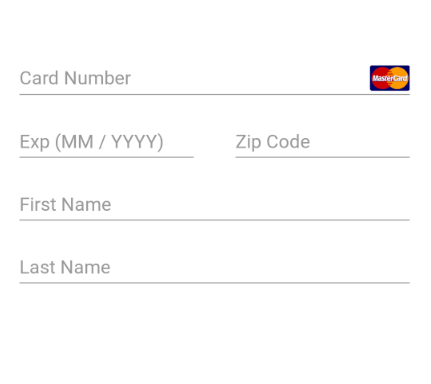
A typical Credit Card entry form in the US
There’s no focus there, so what you’re seeing are the unfocused hints.
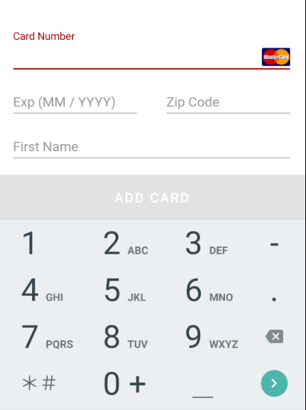
This time we now see the Edit Text has focus, but there’s no text. The hint moved to the top (now in “red”). The Line is also red, because it uses the material Primary Color by default. And remember I was referencing ?attr/primaryColor ? Well, there’s that. You can change that too, I forgot the name of the attribute in your style… because they are very easy to remember an discover, said no one ever.
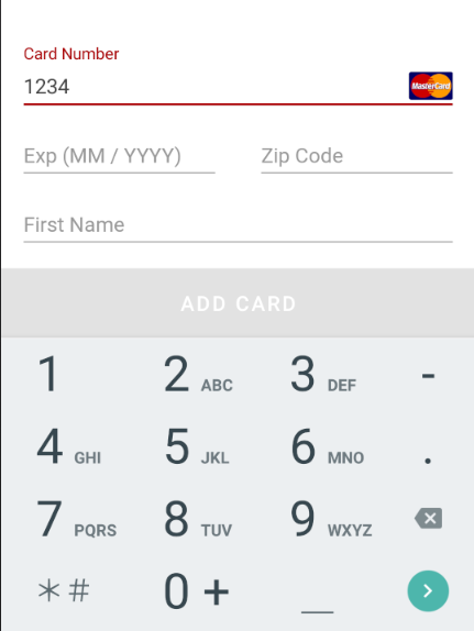
Now we’re typing text. The text comes from the EditText and not the wrapping layout.
And last, but not least, when the field has text and no focus, it looks like this:
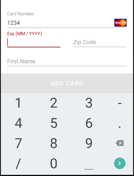
Now the focus is in the Expiration Date field, but the Card Number’s hint is handled by the wrapping layout.
Conclusion
There may be better ways to handle this and I didn’t even need “error” states (the errors are simply shown with the standard Android UI for errors in EditTexts), but if you need to customize the colors, good luck with that. setTextHintColor in the TextInputLayout appears to be only available on API 23+, so you’d have to deal with styles and text attributes. I don’t even know.
I wonder if there’s a better way to do this. ¯\_(ツ)_/¯
UPDATE 2018: There has been a lot of talk in the community about Themes, Styles, and Attributes; I have been part of the screaming crowd asking for a better solution (I still do), but I think the engine is very powerful. I believe Google should focus on a tool (Android Studio plugin, standalone app?), or an incredible powerful search/discovery site, so we can say: I want this Widget to look like this, show me all I can do and give me a preview.
Material 2.0 is adding a lot of these, and with a lot of Android components going ASOP, it’s no surprise Google is aware of this. I just hope one day we don’t have to spend 3 hours trying to style a Widget that doesn’t work out of the box. Keep asking Google for solutions, maybe one day the Keyboard will be easy to show and hide without our layouts being resized or panning all over the place ;)
And last but not least, I have found a better article about this written by Erick Chang. Remember my words: Don’t copy and paste, read, experiment, and learn instead. I have found a few references there that I didn’t know, especially when you also need custom fonts, go take a look and good luck!
July 2020: This story originally appeared on Medium; for personal reasons I’ve chosen to leave Medium behind and exported my data using the tool described in this post hosted at, you guessed, Medium. The irony.